|
Recently read something that caught my interest. There was an article where a comment was made about how "lazy" a certain cosplayer's gijinka design was. The author's solution? They suggested "just make a catsuit"... Now I don't think a catsuit would make a "bad" cosplay (I don't think there's such a thing as a "bad" cosplay, in general). A catsuit could be great, amazing and creative! That's not the problem. To compare that idea, in such a negative way, to one who simply looked at it a different way was a little... ignorant. Part of the fun in designing a gijinka cosplay is how creative you can be! There's so many different aspects to take into account that can go a lot farther than just the physical shapes and colors. There's no limit to what one can do because it's your very own design! If you aren't sure what I'm talking about and looking to add even more into your gijinka design or if there isn't too much there for you to go off of to start with, then this post may be what you need! What Are You Cosplaying?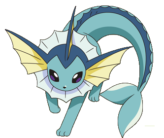 So lets start! Since it's probably some of the most common characters that have a gijinka designed for them, we'll be using Pokemon for this example! Okay, so we've decide what we're going to cosplay and it's a Pokemon! More specifically, let's say it's Vaporeon (at least for these next few examples). I know, this was a very basic step. Not much more to say, just needed this covered to move on. What Does The Character Look Like?Let's take a look at Vaporeon. It's yellow, white and two shades of blue in color. There's three "ears" on it's head, a collar around it's neck, it has a mermaid-like tail and scale/fin-like detail that go all the way down the back. It's skin/texture also appears smooth. So what can we do with this information? Well, just by looking at it we can already decide on what our color choices should be for the materials (whether it be paint or fabric); blues, yellow and white. We can also decide on the texture (if you're not going for an armored version--that usually changes things up a bit, but we'll touch more on this later); smooth. We also know we should probably include some key details like the ears and collar piece. The webbed shaping of the fins, collar, and ears is pretty significant too. We can make this will be a reoccurring shape throughout the outfit. Where Do They Live?This is very important! The area in which they live can definitely help you figure out what kind of design/style to go for. If they live in a hot, sunny dry area, you'd typically want to design something meant for that climate. If they live in a cold, snowy area you'd probably be looking towards designing something warm maybe with a lot of fur or layers. What about a desert? Or specific region of the world? Is there any sort of traditional clothing or style common to that area in real life? What about the time period? What would people where in those days? These are all things to consider! Vaporeon lives in the water, so going for something with a water vibe--whether it be mermaid themed or pool party themed-- is a pretty fitting idea. The Pokedex entry also mentions it prefers beautiful shores. That can make the idea of designing something with a little bit more elegance and very detailed pop into our head! What Are Some Key Aspects?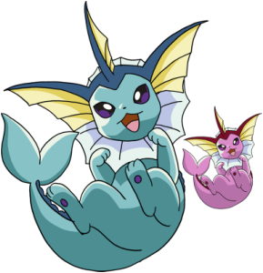 What stands out about the character--more than just appearance? For Pokemon we can instantly jump to their typing, the moves/abilities they have, and other information easily found in the Pokedex in games (or Wikipedia pages). So for Vaporeon, we know it's a water-type, it learns a majority of water-type moves, and it evolves from Eevee. The Pokedex entry also mentions that it's molecules are similar to water (it can even melt into it) and that it's tail is often mistaken for that of a mermaid's. So from this we can decide to lean towards a water-fitting design. Maybe something mermaid inspired or maybe some sort of bathing suit--made with water friendly materials. The fact that it's molecules are similar to water can bring about the idea to use fabric that moves and even sort of looks like water. You could also go about this a completely different way. You could decide to play more into the fact there's multiple Eeveelutions and make one uniformed design with slight tweaks for each individual characters. This could completely change your choice of fabric and if they environment/typing is important to consider or not. What About Personality?Personality is an important aspect! How does the character behave? Are they a bad-ass and edgy? Shy? Super serious? Young and playful? Seductive? Depressed and sad? Happy and motherly? If a character is childish and playful then it's probably a good idea to go with something youthful and easy to move in. If they're edgy and dark then maybe it's fitting to stay away from too many bright colors, throw in some spikes and a biker jacket? If they're motherly, think about what a mom would wear--maybe a classic 50's portrayal of one? Now Pokemon may be a little tricky. But if you watch the show or check the Pokedex entry you can sometimes find some information about their personalities. If they don't mention that then go with what you feel. I've personally always felt like I could do something glamorous and elegant mermaid-wise or something fun and playful for Vaporeon. What Do They Do?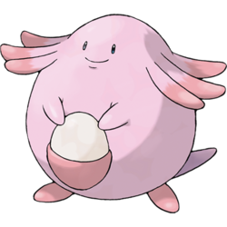 What does your character do? Do they have a job? What about hobbies? If they like to cook, how about adding some sort of apron to the design or chef inspired outfit? Do they play sports? What kind? Maybe you can do some sort of sports attire fitting to them? I know for Pokemon this can seem a bit irrelevant. For most gijinka designs this can be difficult to think about. After all, gijinka designs aren't inspired by humans... or at the very least, they don't always have human-like traits (such as jobs and hobbies). So instead think about it in a different way. If they were human what would they do? What do you think their job would be? Would they have any hobbies? Do you see them playing any sports? Their owners/trainers, what are they like? What do they do? Does the Pokemon get along with their trainer? Are they similar? If so, you can probably bet they'd be doing the same things as their trainer if they were human. Is their trainer more like a mother to them? Like how Misty is to Togepi! We could easily make a Togepi design inspired by children wear or something youthful. You can get fairly creative here! For Vaporeon, mostly because of the water aspect, I can see it being a swimmer. Maybe a mermaid--I know not fully human but close. Maybe some sort of royalty?! For a Pokemon like Chansey we could probably go with something motherly! Chansey is usually in the Pokemon Center in the cartoon, so if Chansey was a person we could only assume it'd be a nurse, doctor or some sort of caretaker. Something that comes off as warm, caring and welcoming, probably modest and mature, seems fitting. Obviously a nurse or doctor inspired outfit would be great!  Putting It All Together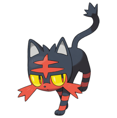 At this point, you collect all the research you've done, taken into consideration many different aspects and now it's time to piece it all together. So for Vaporeon we know we want something water-friendly or water-themed. We probably want to use smooth or flowy fabric (most likely bathing suit material), maybe a mix of both. We also want to keep significant details, like the ears and collar. At this point we could come up with a few designs. There's the option of doing something mermaid-y. Add many elaborate details, use light-weight fabrics that could be airy and flowy in water, and give it a mermaid gown shape to it (if not a full on tail). Or we could do a bathing suit. Something fun and cutesy with extra shapes added on and hems cut to match the shapes of the fins. Now it's just up to you to decide and give it your own personal touch! I think the design above (by hokoricupcake on DeviantArt) is a great mix of both! I want to use two examples for this. I've touched on Vaporeon but now I want to do an overall look at another Pokemon. So let's use Litten. Looking at Litten we know it's a cat-inspired Pokemon. It already looks a bit sassy just by design (also cats are typically full of sass, lets be real here). The colors we'll be sticking to are red and black and there's a significant marking on it's forehead. The cheeks/whiskers, tufts of hair on it's head, tail end and stripes on it's legs can also be taken into consideration. From looking at the colors, I instantly go to something edgy, punk-ish and rocker. Red and black are a common combo seen in punk/rock outfits and styles. I feel for a cat this is also fairly fitting. We could also take into consideration other cat-themed characters, such as Catwoman. It's common to see cat-themed characters portrayed as sexy and a villain, so creating this sexy, bad-ass design is another path we can take. It's also a fire type! With fire I usually go with something, well, fire-y (spicy, edgy, sexy, etc--can all be fitting options). I feel Jessica Nigri and Danielle Beaulieu did fairly decent takes on this! But don't worry. If that's not you're style you can definitely go with something else! It is a starter Pokemon, so another option could be something spunky, young and playful. Or even a catsuit can work! Throw in the colors you need, add little touches and bam!
Armor and Other Themed-Designs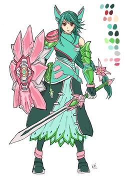 Okay so this is where things really change up! If you're doing an armored design, or something glamour inspired (like a red-carpet gown), pool party themed or even PJ themed, it'll be a lot different. You don't have to consider as much. When you have a bigger theme to stick to then all you really have to take into consideration is the colors and signature markings or details. Take this Venusaur design (by bulletproofturtleman on DeviantArt). You can see the Venusaur in it and at the same time it still may be something different then what you were originally thinking was fitting for Venusaur. It has all of the colors, the designer changed the signature flower on the back to a weapon/shield so it's still included in the design, and they also threw in other flower aspects--keeping true to it's design as well as considering the fact that it's a grass-type. While it may not be a soft or hard of a design as you'd think when thinking of Venusaur, it still represents the Pokemon well. It's taking classic armor pieces and modding them to fit a Pokemon. There's many people who take inspiration from various World of Warcraft sets, for example. They use those sets as a sort of starting point and then change and recolor pieces as needed--adding on details and removing others, changing shapes of the edges, etc--to make it better represent a different character. My point is, you don't always have to take into consideration every last details. You can pay more attention to some details than others. It's all about what you feel would fit your design the best. The only thing that may be really important to keep are some signature aspects the character is know for (for animal-like character it's typically the ears, tail and/or the texture of it's fur/skin and maybe the pattern of it). And even then you don't absolutely have to if you don't want to. There's many ways to incorporate these different aspects. I feel the various things mention will help anyone who's stuck or doesn't know where to begin. If you just can't get a good idea start looking more into the character, research different aspects of their environment or personality or pick an outside theme (like armor or glamour) and design towards that.
Ultimately it's up to the you to decide what you feel is fitting and it shouldn't really matter what anyone else thinks--cosplay is for fun and as long as you're having fun, that's all that matters! So just enjoy yourself, design a billion different designs before picking one, explore your talents and tastes--just have fun and love what you're doing. And to anyone who doesn't like it... well, then you can make it yourself, the way you want it done and just leave the other cosplayer be--because obviously they're happy with their design and there's no reason they shouldn't be. Happy cosplaying! ~Positive Outcomes Only~
0 Comments
Sharing one of the ways I make some of my patterns for my cosplays! :) 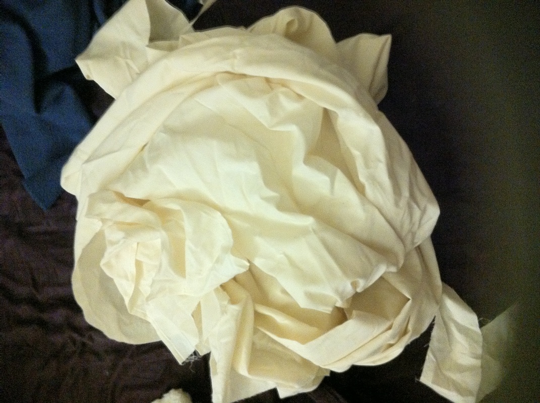 So I usually try to find a pattern at my local fabric store that is as close as possible to the design I need. If I can't find something that's exact I'll find something close to what I'm looking for and alter it later. If the pattern is super simple I'll use a t-shirt to help with the sizing and guidelines as I draw something up (mostly eyeballing to start). This is where mock-ups and cheap materials come in handy. Before cutting any of the real material I'll be using, I'll create the final patterns (when a pattern needed to be altered or is drawn from scratch) on the cheap material. A cheap material I've seen many people use for mock-ups (including seeing it used on Project Runway) is muslin. I'll typically buy 5-ish yards at a time. 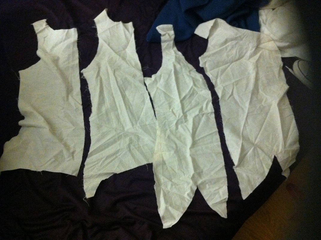 If I'm altering a pre-existing pattern, I'll trace all the pieces onto the muslin and then change what's needed, adding or taking away from the pattern. When it looks right, cut it out and pin it together (you can even sew it together if it has a lot of pieces, just keep a seam ripper nearby and use a loose stitch). 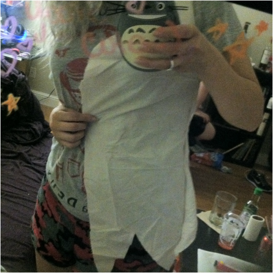 It's important to put it all together so that you can try it on and make sure it looks right and fits well. This is when you make any changes. It's easy to just cut and take away fabric if you need it smaller or redraw a piece if you need to make it bigger or add on more/completely change something. Using cheap fabric to create mock ups allows for you to make as many mistakes, changes, etc as you want without wasting any nice and/or expensive materials. 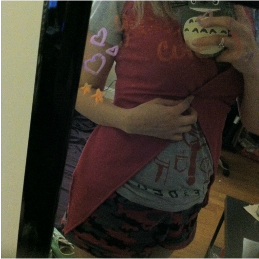 Once everything fits well and looks the way you want, it's time to undo any pins or stitching on the mock-up and transfer that pattern to the real fabric you'll be using. Sew it together and done! Add any finishing touches and details as needed, of course.
There are other ways of creating and making patterns as well. Some people use newspaper--I have and still will too, mostly when making armor. Newspaper is flimsy and can tear easily, so I don't bother too often with trying to make dress and pants patterns out of it (at least not when I'm wanting to wear it/try it on before using the real fabric). There's the duct tape method too. Although, I've found that with this, even when wrapping the duct tape as loosely as possible, it will still "corset" you a bit and the pattern can come out anywhere from slightly smaller to a lot smaller than what you needed, depending on how tight the duct tape was wrapped. It is handy when working with stretchy materials and designs that you'd want tighter. I hope this was well explained enough for you all to find it helpful! :) ~Positive outcomes only! :) This works best with and I'd only recommend using stretchy materials when following this tutorial. 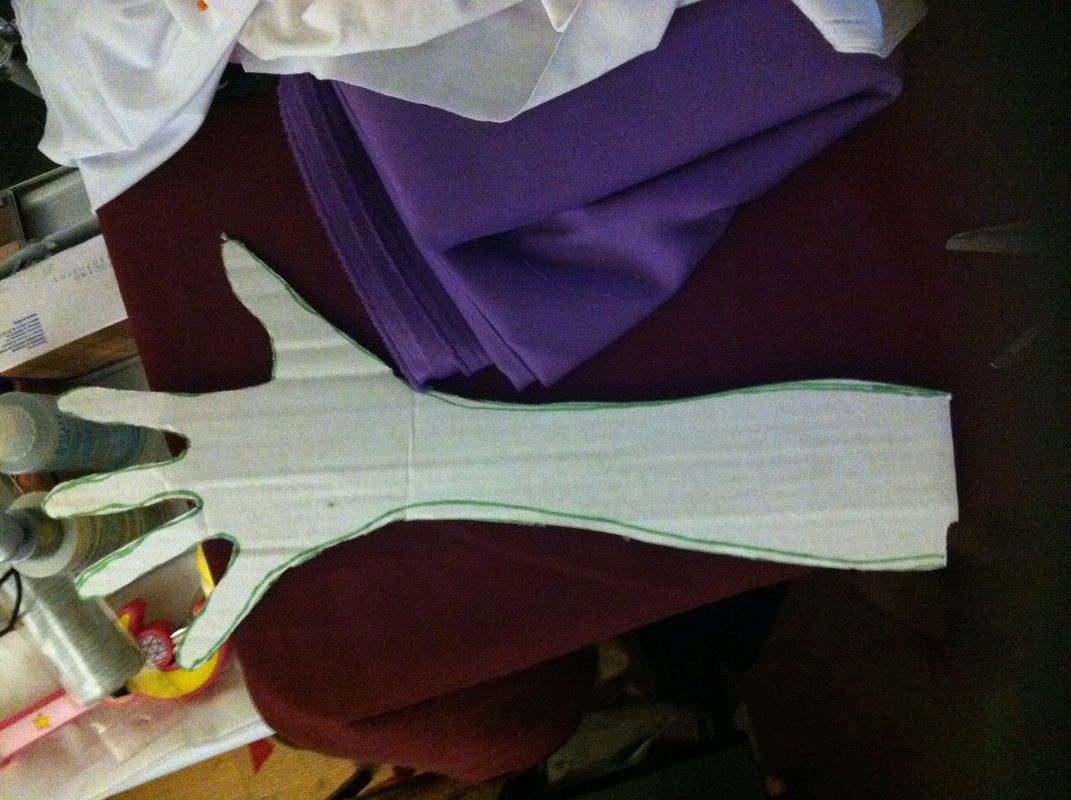 Trace your hand and as much of your arm as you want onto a piece of cardboard, then cut it out. You should get something like in the photo above. 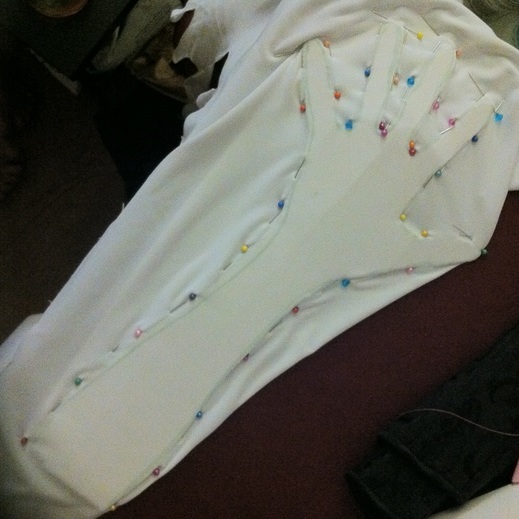 Next take two layers of whatever fabric your using and place it below and on top of the cardboard hand. Have the right side of the fabric facing inward, towards the cardboard. Pin along the edges. 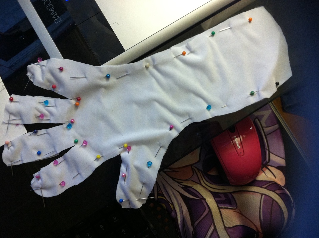 Cut off excess fabric/around the cardboard, give some seam allowance. Then remove the cardboard. This can be a little tricky and some pins may come loose.Outlining the shape using fabric marker/chalk or using safety pins instead of sewing pins could be helpful. 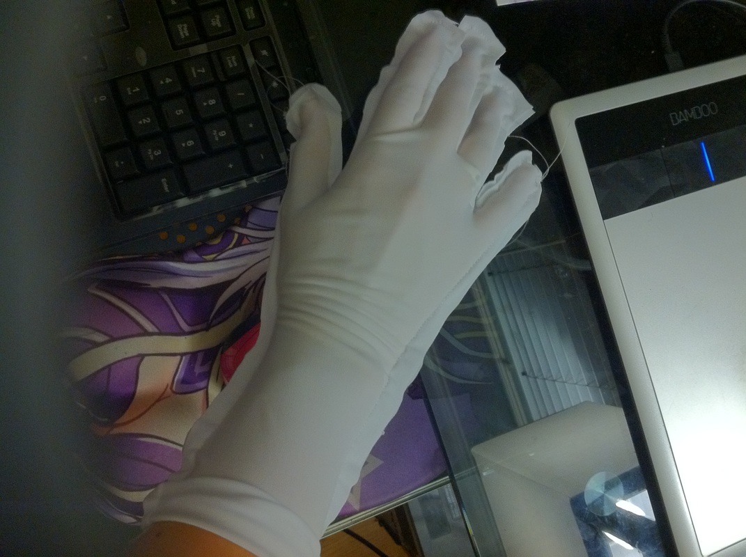 After that, sew it up. Cut off any excess fabric and finish your seams. Remember to add whatever other details you need before or after sewing the glove pieces together depending on the design. And your finished! 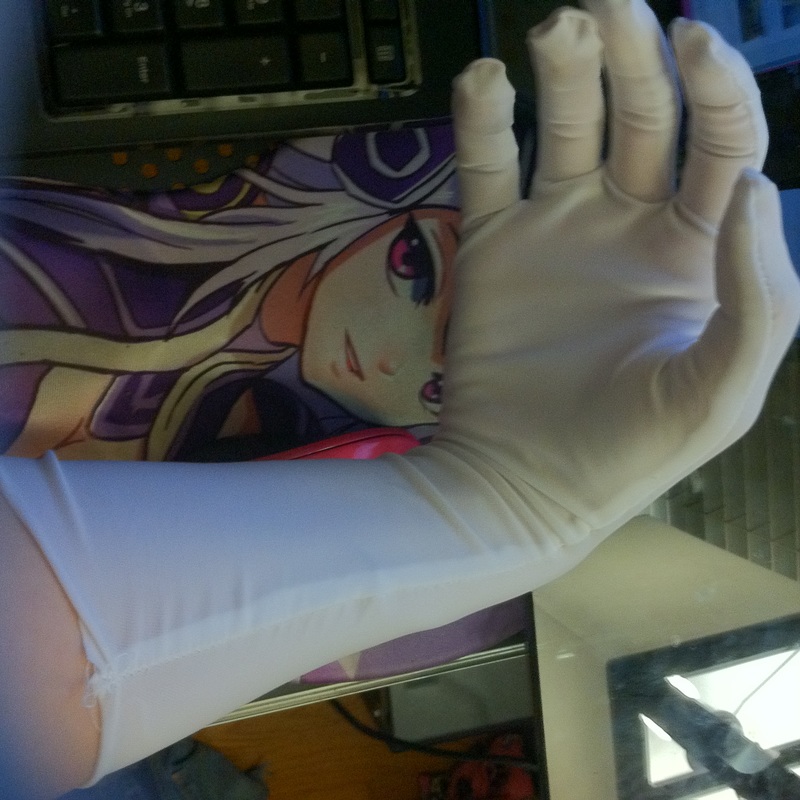 I hope this was explained well enough for you all to find it helpful! :)
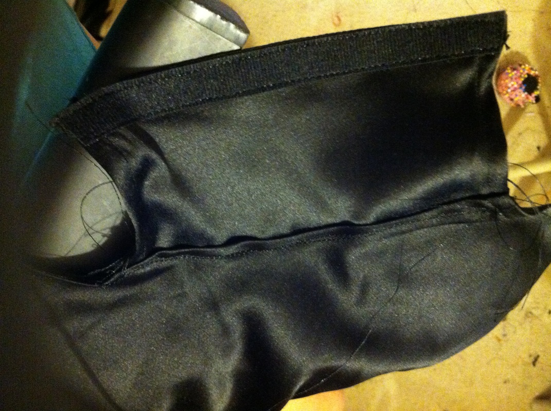
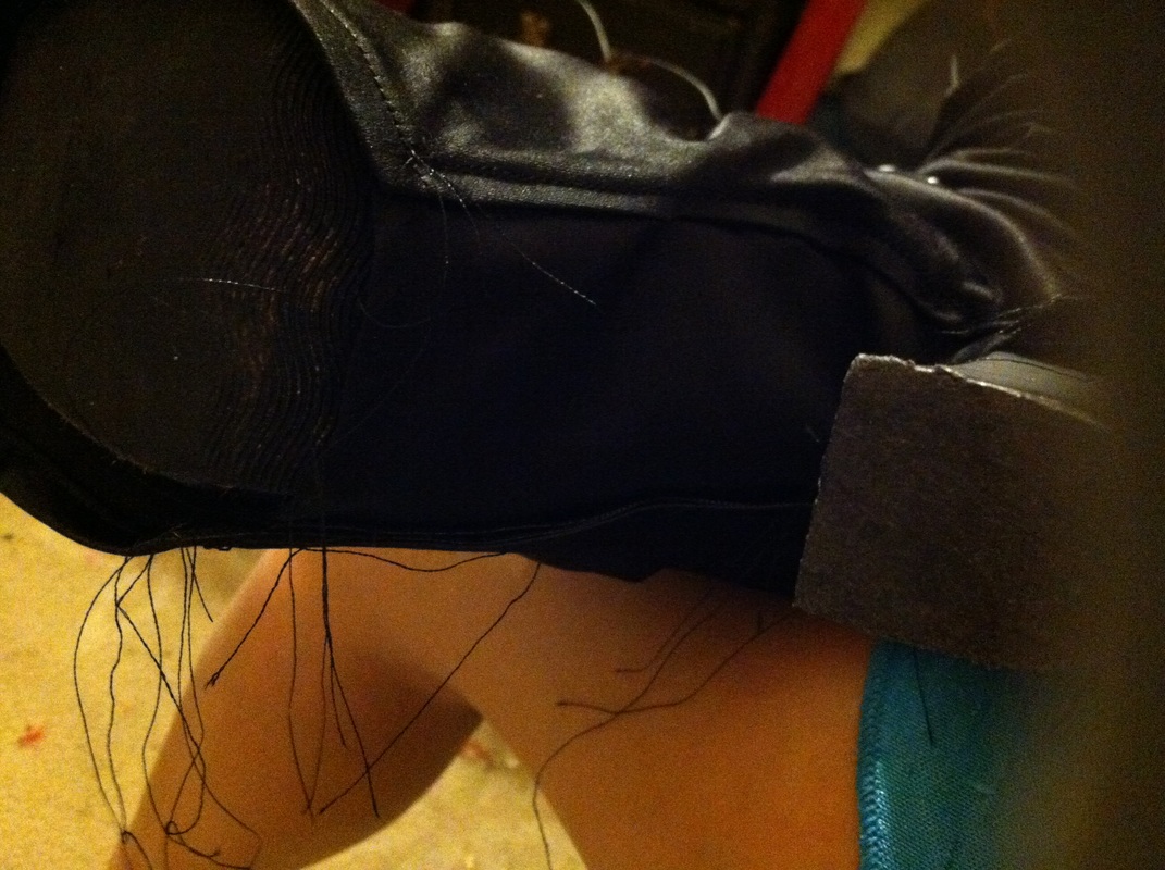
~Positive outcomes only! :) 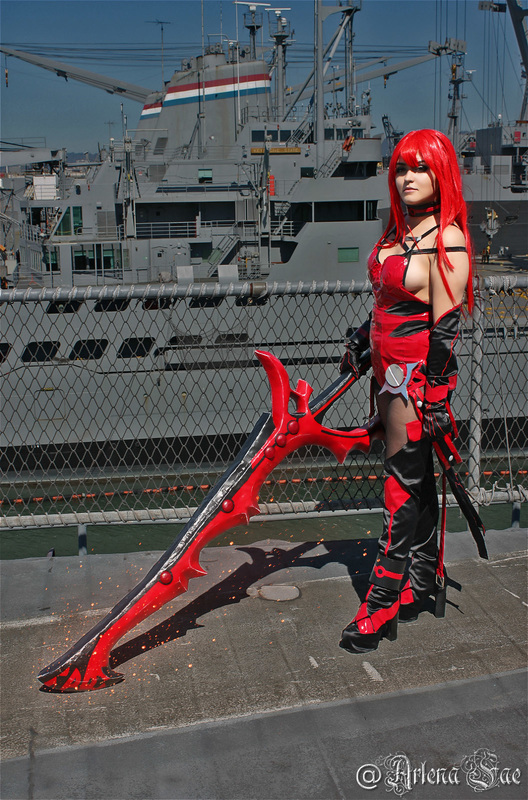 This is how I made my boot covers for my Elesis cosplay. I hope this is able to help you--even with my poor quality photos. 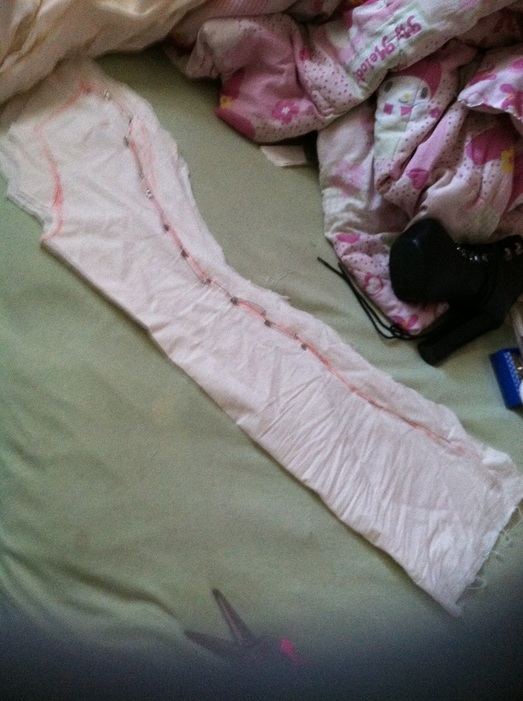 First I made a mock-up using muslin fabric. To create my pattern I laid my leg (wear the shoes you'll be using when doing this) on the fabric and traced around it as best as possible, giving some extra room since a leg isn't, well, flat. It's a good idea not to cut out the exact shape until later, for now keep some extra fabric around what you have traced out. The fabric I'm using for the boot covers is not stretchy. You need to take that into account when making boot covers. With non-stretchy fabric you either need to widen at the ankles or add a zipper. Ankles are typically much smaller than your foot, so that part of the boot cover may not slip over your foot. A similar thing can happen at the knee--this is why it's a good idea to make a mock-up, to make sure everything fits right and avoid messing up on the nice (and probably more expensive) fabric. For stretchy fabric you probably won't have to worry about these problems. You typically size stretchy fabric smaller than your actual measurements so that it'll fit correctly and snugly when worn. 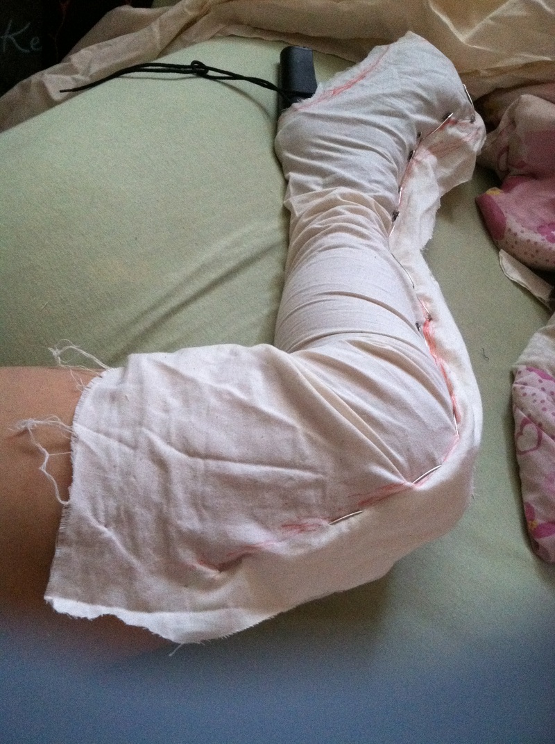 Cut out the pattern plus that extra fabric and pin it together. Then try it on. Keep adjusting the pins as needed until you're about to slide it on and off with little to no difficulty. If you're using a zipper just make sure to have a bit extra for attaching the zipper--other than that just make sure it fits well, no need to slide it on and off except at the foot. If you're using stretch fabric, it's probably best to just pin the fabric snugly around your leg from the start and use that. Muslin is very stiff so it won't behave like the stretch fabric will. If any changes are made I like to retrace along the pins--in a different color. Then cut off any extra fabric but leave some room for seam allowance. 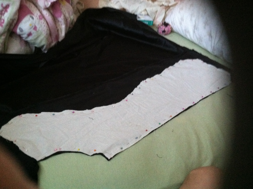 The pattern should create two pieces for each leg (a total of 4). Don't worry about the bottom of the foot for now. Transfer this to the final fabric and cut that out. If you're boot covers are like mine where the sides are different from one another, make necessary changes either to the mock-up or on the final fabric before cutting. If the sides are different then you should have 2 different mock-up pattern pieces, making one of each for each leg (a total of 2 of each). Sew all your pieces together, finish your seams and your hems and you'll be done with this part. Remember leave the top and bottom open.
For the bottom part of the shoe these are multiple ways to do this. You can trace the bottom of the shoes onto the fabric, give seam allowance and attache that to the rest of your boot covers--probably best for flats. I've seen peoples sew it like socks, so you just sew the entire thing at the foot shut---works best for stretch fabric. What I did was trace the arched part of the heel--a rectangle shape--and sewed that onto only one side of the boot cover. On the other side of both that flat and the boot cover I added a thin Velcro strip. So I'll be able to put the boot covers on then Velcro it at the bottom for security.
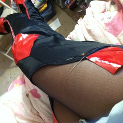
If your boot cover needs help staying up, you can use fashion tape or tights like what I did. I used black tights because that's what the costume called for, but for those with skin showing nude tights will work. Put on the tights, then the shoes and then the boot covers. Make sure both boot covers are even and in the correct place and pin the boot covers to the tights, along the top. I decided to hand-sew the boot covers onto the tights--when I tried to take it off and then sew it, it wouldn't stretch the way it needed to when worn again. So just be careful when hand sewing, although pricking yourself a few times is probably unavoidable--the pain of cosplaying. I only sewed along the highest point of the boot covers. You can sew all the way around if you want, but it's very difficult, if not impossible, to sew anything behind you. If you really want to, I suggest getting someone to help you. I had also added all of the details onto the boot covers before sewing anything to the tights. 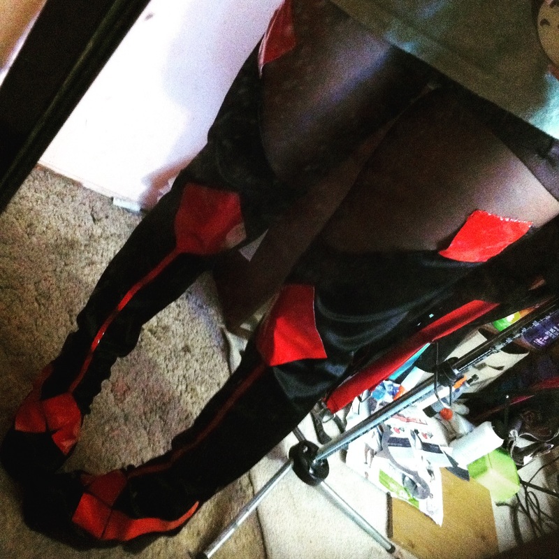 And that's how I made my boot covers. I hoped this explained everything well enough and is able to help some of you cosplayers out there! :) ~Positive outcomes only! :) 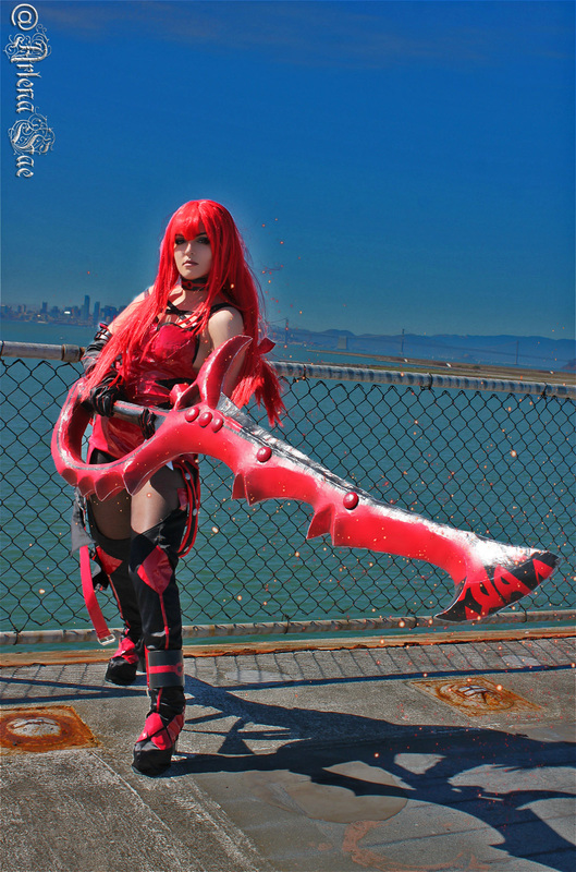 For anyone who's wondering how I edit my photos. These are editing techniques I use mostly for cosplay or human-subject photos (in other words, something like food or scenery doesn't get edited this much or even goes through these techniques/tools). So of course, go through and pick out all the photos that are keepers and will move on to the editing phase. I use Photoshop Elements 8.0 to edit my photos. The photo I'm using in this example is a photo I took of my friend and cosplayer, Courtneykissme, in her Arcade Miss Fortune (from League of Legends) cosplay. 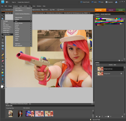 So one of the things I like to do is create super smooth skin to make it look as if the photo is a digital painting or straight from the anime/video game (some great examples--and editing skill goals--are the amazing and professional shot Lightning--from Final Fantasy--cosplays photos you'll see around the internet). This is how I achieve that effect or something similar to it. Duplicated the original image into a new layer. Right click on the image and select Duplicate Layer. Make sure the new layer is selected. Then hit Filter -> Blur -> Surface Blur 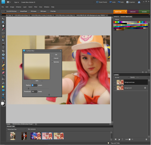 Once you've selected Surface Blur move the threshold slider all the way to the right, maxing out the numbers. From there adjust the radius glider so that the face appears blurred but still recognizable. 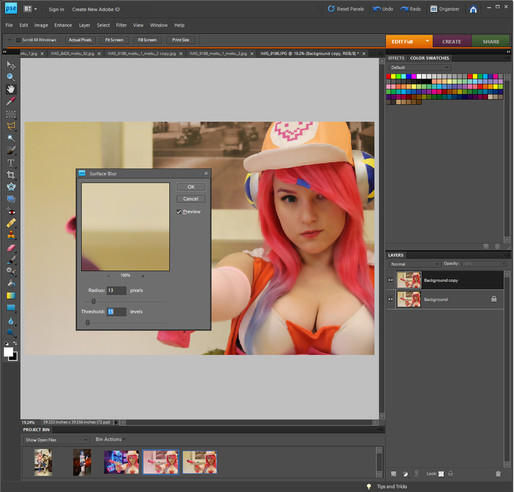 Once you've set the radius glider move the threshold glider to the left until the skin appears smooth but not blurred. It'll usually start looking right around the same number setting as the radius or slightly lower. Hit okay. 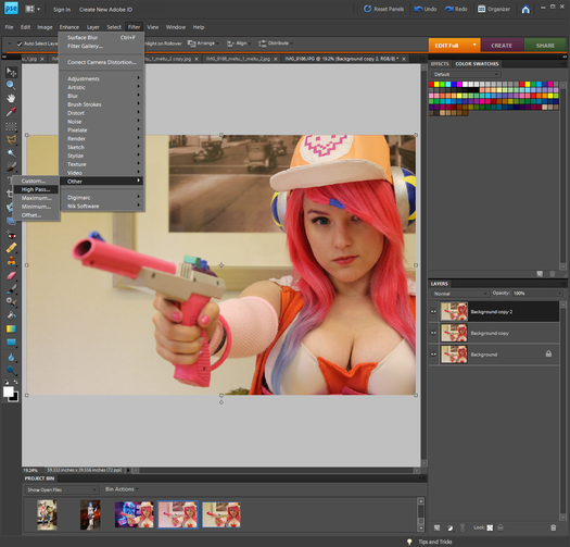 Make another duplicate of the original image and move it so that it is the top layer. Make sure that layer is selected. To add some definition and details back into the clothing articles and hair hit Filter -> Other -> High Pass. 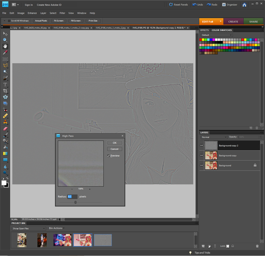 From there adjust the glider so that you can see the details in the hair, skin, clothing. For this you're going to have to eyeball it. Try not to put the glider so far to the right the color begins to return (you'll see what I mean if you glide it to the right). Hit okay. 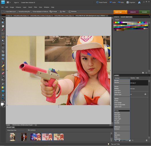 We don't want the photo stay grey. In order to change this go to where it says Normal and has a drop down menu above the layer listings. Click the drop down arrow and select overlay. 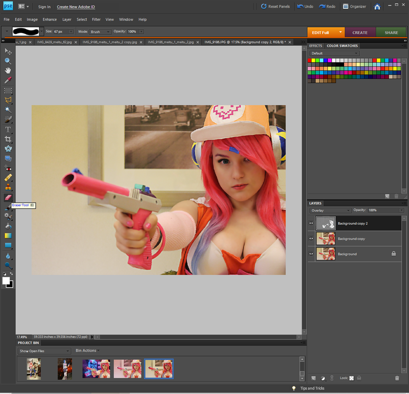 Everything will appear to have more detail and definition again, but I still want the skin smooth and almost-digital looking (aka I want the Surface Blur-ed layer to be what the skin looks like). Still working on the same layer (the High Pass-ed layer), select the eraser tool and begin to erase anywhere the skin is. Feel free to erase any other areas you want to appear smooth or have the effect it was given on the Surface Blur-ed layer--I just stick with the skin. Tip when erasing; work slowly. I avoid just erasing over large connected patches (such as the face and the neck) carelessly. I don't want the line of definition between two areas to fade and soften so I erase ever so slightly around them, avoiding the line itself. Example: I won't just scribble the mouse/tool over the whole face, I avoid the eyes, lips, brows and move around the nostrils and lines defining the nose and jawline. 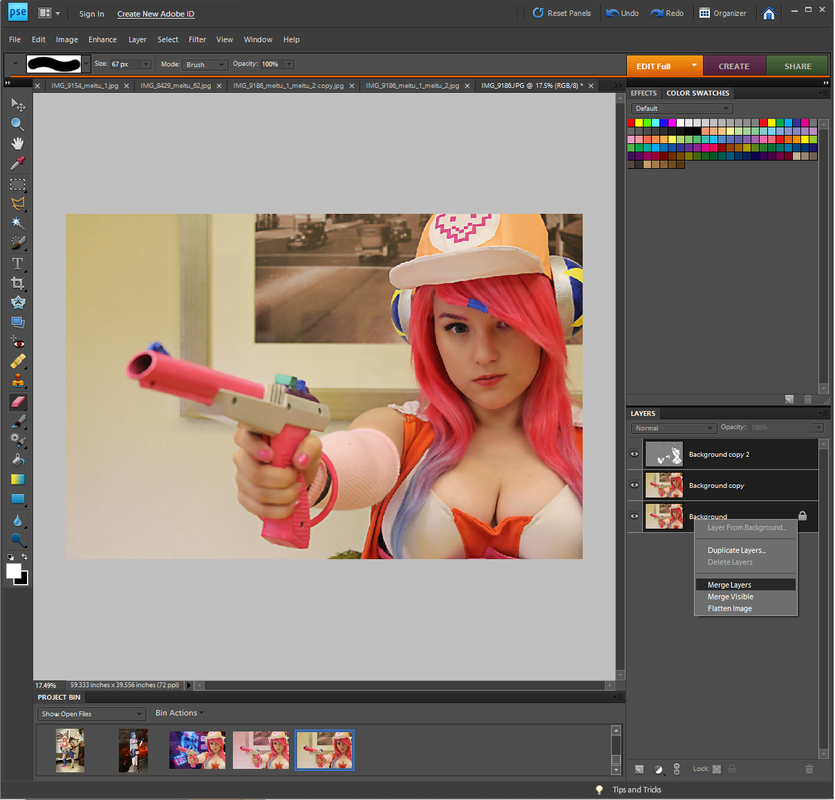 Once your happy with how everything looks so far, merge the three layers together. Ctrl+Click all three layers --> Right Click --> Merge Layers. 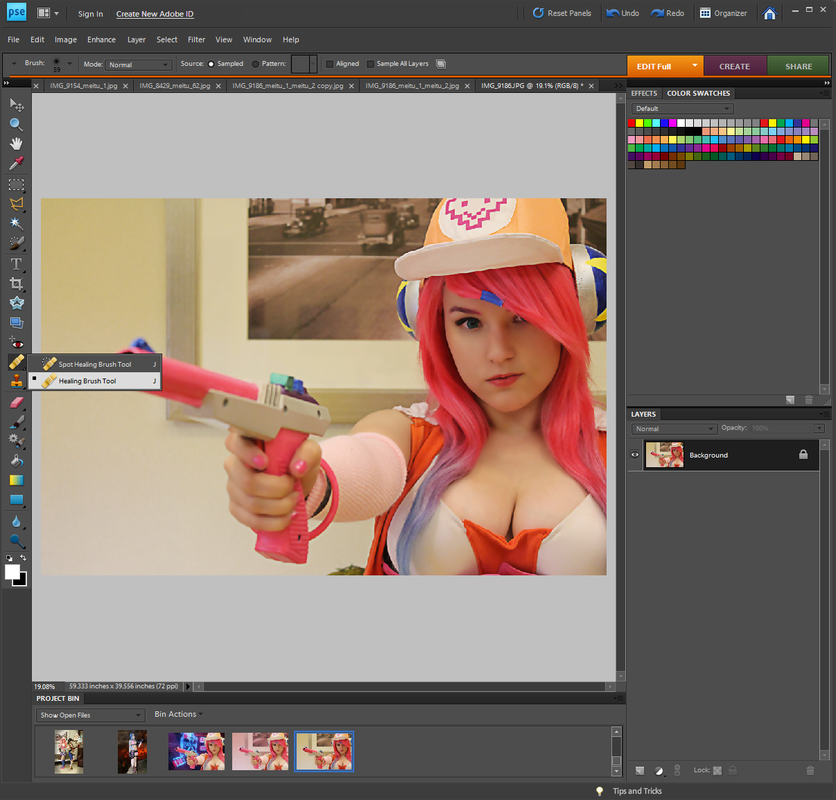 Another thing I do is remove any blemishes, spots of discoloration or dark circles. This can be done at any time, although I do prefer to do this as a first step. For this I use the Healing Brush Tool found in the tool bar. You're able to Alt+Click any spot of skin without blemish/discoloration, then Left+Click any spots you want to cover up. This helps the skin look smooth, clear, even and helps the photo look professionally done. This isn't a necessary step, it's all up to personal preferences and not everyone "needs" this editing done. I just feel it helps give the photo a professionally done feel. I also stated that I do love when photos look like they're straight from the game/animation, or close to it. 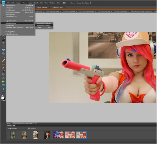 Another thing I will do, especially for photos taken in not the best lighting, is adjust the lighting. Enhance --> Adjust Lighting --> Brightness/Contrast. 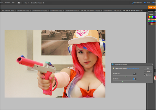 Adjust the brightness or contrast by moving the gliders. This is all left up to personal preference and what you feel looks best. Hit okay. 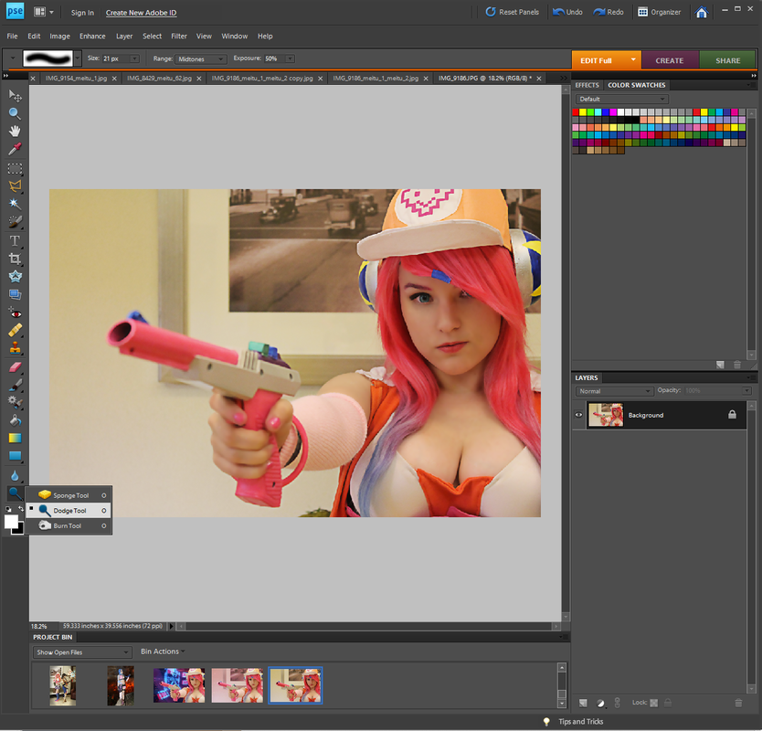 Since I don't wear contacts I'll alter the eye color (the cosplayer in this photo is wearing contacts though). I didn't get a screen shot of this but basically. Create a new layer. Using the basic paint brush tool and the color of your choice, carefully color the iris of your eye (the colored part). Once both eyes are filled in adjust the opacity to make it look more natural. You want details and shadows from the underlying image to show through but not so much that the color of the eye doesn't change. You can also soften the lines using a slight Gaussian Blur. Another way of changing the eye color is selecting the iris of both eyes. Enhance --> Adjust Color --> Adjust Hue/Saturation. Move the Hue (top) glider until you achieve the color you want. Do this on either a duplicate layer of the base/original image or the original image itself. Something I'll almost always do as well is use the Dodge Tool on the iris of the eyes. Since my eyes are really dark and remain having a very dull or dark look to them even after changing the eye color I like to brighten it up and/or add highlights using this tool. Make sure the brush size is small and to remain in the iris of the eye only. I'll sometimes overlap brush strokes a couple times to make it brighter/more highlighted in certain areas (pay attention to where the light is hitting naturally). 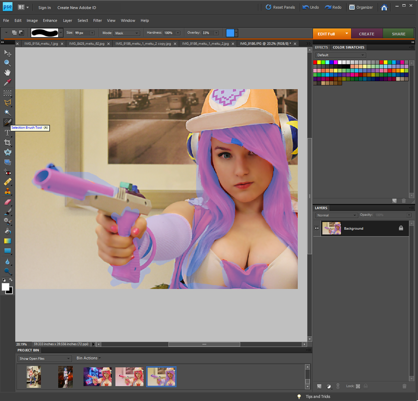 Note: This is sloppily done because I just did it for screen shot purposes. Please know when actually editing I use and try my best to keep neat clean lines. Another thing I do is add to and take away from specific colors and areas. In order to avoid taking hues away or adding them to areas you don't want to, use the selection tool and select the area you want to edit. 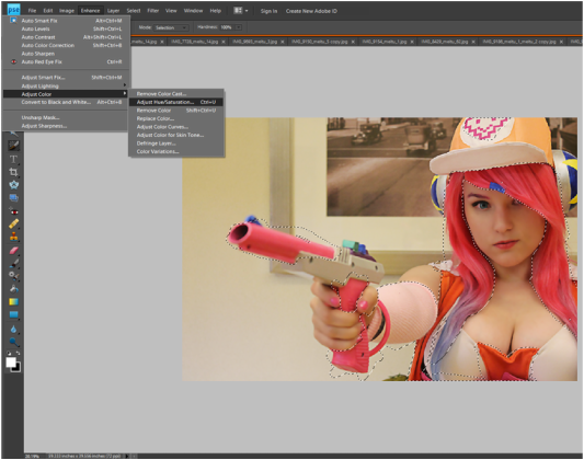 Once selected, go to Enhance --> Adjust Color --> Adjust Hue/Saturation. 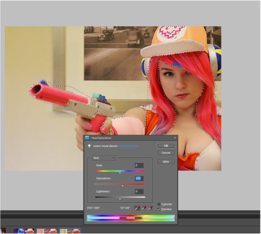 For this specific photo I want to brighten up the pinks in the costume and hair. So in the drop down menu I select Reds and more the Saturation (second) glider more towards the right until I like the coloring. Hit okay. 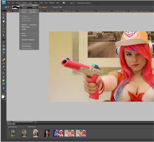 You can either go to Select --> Deselect or hit Ctrl+D. Select new areas you want to change if there are anymore. I'm selecting the skin and background. 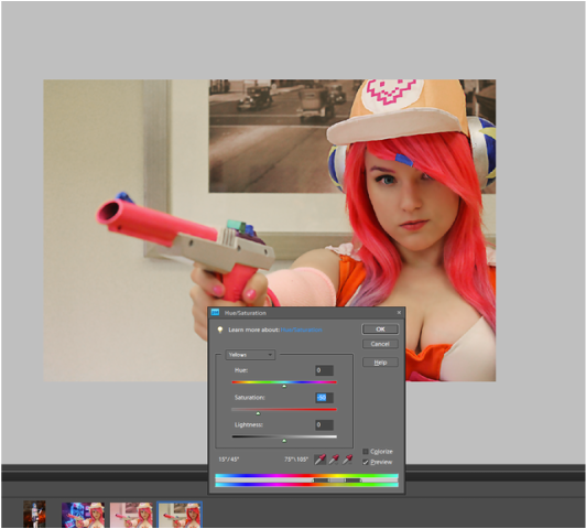 So going to the Hue/Saturation Adjustment menu, I select Yellows in the drop down menu this time. I personally like to remove the yellow tones from lighting and the skin depending on the photo. I feel it makes the photo look more clean and professional. But depending on the style of photo and editing it, yellow light can add to it. It's all preference. In order to remove the yellow tones move the Saturation (second) glider more towards the left. Once it's where you like it hit okay. 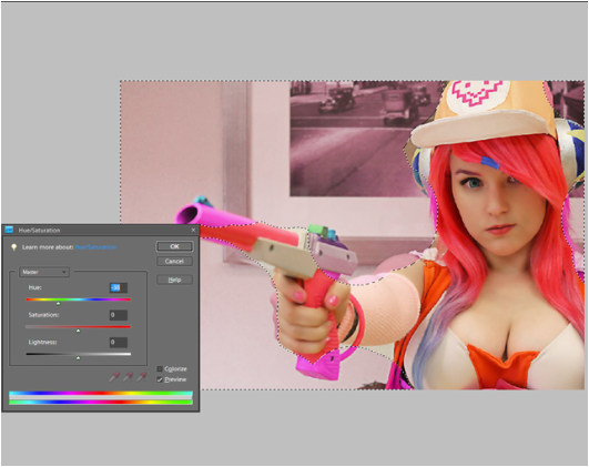 Changing colors of the background or different subjects in the photo. Note this is done sloppily, once again, because I did it quickly for screen shot purposes. Select the area you want to change the color of and open back up the Hue/Saturation window. To change the color drag the slider along the Hue bar until it's at a color you like. You can alter the darkness/brightness and saturation of the color using the other two sliders. 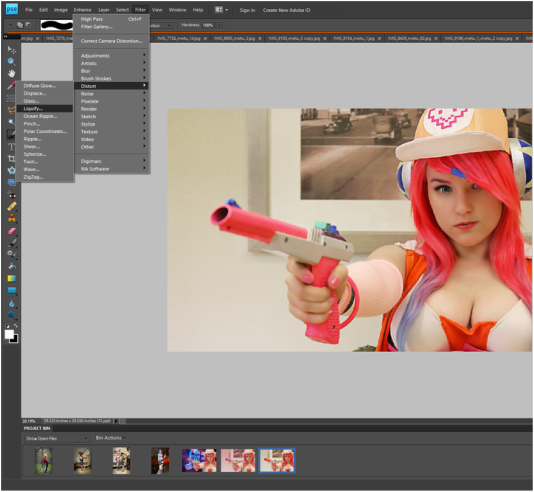 Another thing I'll often do is slightly enlarge the eyes. I like to make it more "anime-like" and other times eyes may be slightly squinted due to bright lighting or some other reason. Anyways, to enlarge eyes you can use a tool found under the liquidfy option. Filter --> Distort --> Liquidfy 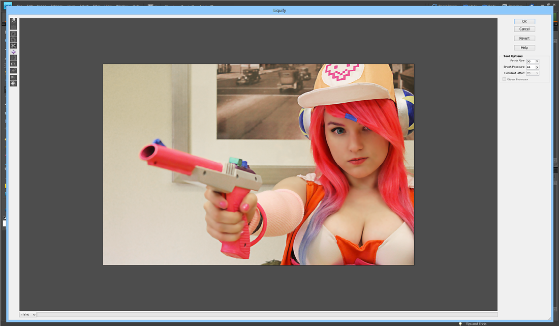 The 6th picture down or the picture of a square with an arrow on each side facing away from the square will be an enlargement tool. It should say something similar when hovered over. Set your brush to be around the size of the eye and just click once or a few times until the eyes are the size you want. I'd recommend not to over do it and to keep it as natural as possible. I like to use this as a little trick to help make the eyes pop or be slightly more fitting to the cosplay/character. 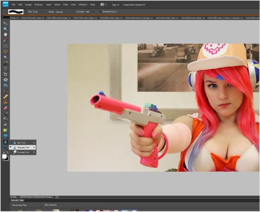 Sometime my camera won't focus quite where I want it to or a picture will be slightly blurred. Usually I find that the eyes aren't as in focus as I'd like. Click the second tool picture from the bottom. You'll find the picture is whatever tool you left off on so it can either be a tear drop, a triangle or a pointing hand. Click image and make sure it's set to the triangle/Sharpen Tool. Adjust the brush size to be around the size of the aspect you're sharpening. For example, when doing eyes I make sure the brush fits just around the entire eyes and simply click once or twice to sharpen it. When doing large object, like an entire person, I make sure the brush is a large size but doesn't fit around the entire person (since people typically aren't a circle--they have limbs and such). Then I'll click and drag the brush around/over the person I'm sharpening. I'll only have to do this once or twice. Keep in mind that if you continue to sharpen an area over and over again it'll begin to look super pixelated and you probably don't want that, this is why I recommend only going over an area once or twice. I also rarely use the sharpen tool at full strength. You'll see an option to adjust the strength in the top bar, a few slots to the right of the brush option. I usually put it anywhere from 30-75%. 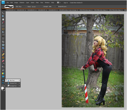 I often blur backgrounds, especially if they're very busy and I feel pull focus away from the main subject (i.o. cosplayer). To do this we'll be going back to that same tool option we just found the sharpen tool under, but instead click the Blur Tool/tear drop. I recommend duplicating the layer for this and do all the blurring on the top layer. I say this because if you accidentally find you've blurred a part that you didn't want to, you'll be able to simply erase it and the original, unblurred photo will be right there underneath. You'll be constantly adjusting brush sizes during this in order to get around the different shapes just right. I usually use a large brush size for a majority of the empty space around the edges (referring to this photo^) and then switch to a brush size of 12 or less when going around or near my subject. For sharp corners, sometimes the circle shape of the brush will mean part of your subject gets blurred, this is where the eraser comes in handy (just erase the subject --or at least that part-- from the layer). I typically set the strength to 100% but depending on the look you're going for you may want to change it. Sometimes I will change the strength several times throughout the photo when I want the blurred parts to fade into an in focus part. In example, if I the subjects just sitting in the grass and I want the grass in the background blurred but not the grass towards the front. I'll change the strength several until it's around 5-10% at the last part to be blurred so everything will blend. You don't need to go down 1% at a time, towards the higher percentages I'll jump down from 10-20% at a time and towards the end 10-5% at a time. 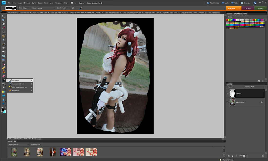 I'll sometimes add a ring of darkness/shadow around the photo or shade different areas of a photo (sometimes I'll shadow the entire background just to make the subject pop). To do this click on the tool picture where it'll either look like a pencil or paint brush. Click on the Brush Tool. Create a new blank layer (can be found at the bottom left hand corner of the layers tab/window). This is the layer you'll be working on. The size you adjust your brush to will depend on what you're shadowing and your photo, you may have to change it several times. For the color choose a black. Then color in the area you want shadowed. If you're doing the entire background leave a bit of a gap around the subject or whatever you're not shadowing. If you don't want even the slightest shadow on your subject make an even bigger gap in between the shadow and the subject then. 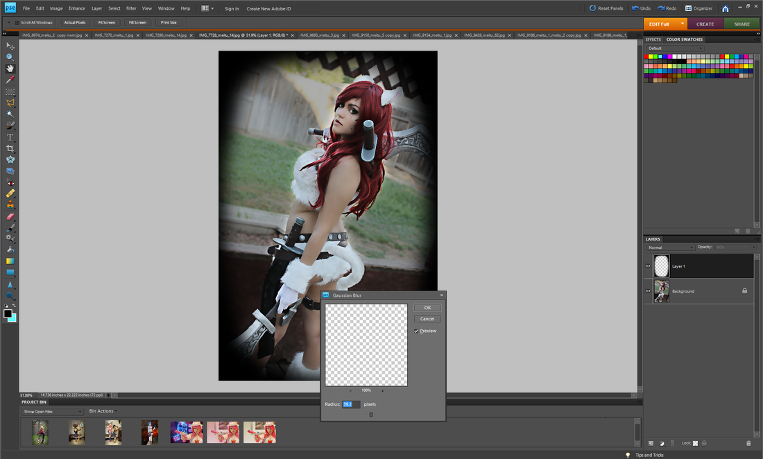 You'll want that gap because we'll be blurring the layer and depending on how much of a fade you want the shadow may get onto the subject after blurred. The more faded you want it, the bigger the gap in between the coloring and subject you'll need. You can always go back in and erase shadows off the subjects but sometimes they may leave weird harsh lines in the shadow that you may have to re-blur (either using the blur process we're going to do right now or the blur and smudge tool). So to blur the shadow and create a fade, Filter --> Blur --> Gaussian Blur Adjust the slider/percentage until you the fade/blur is to your liking. This honestly depends on preference and the photo. 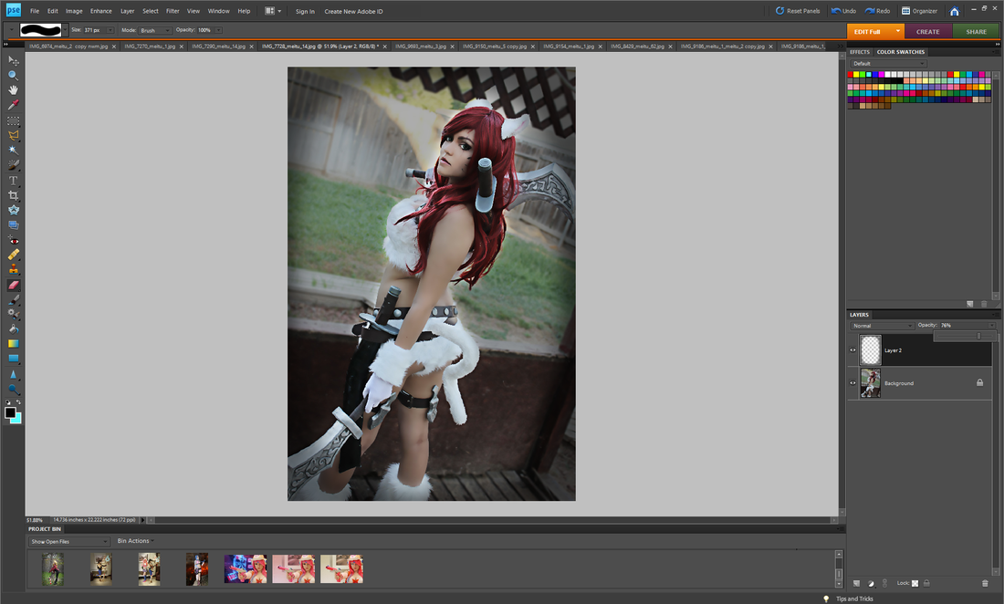 Now to make the shadow more natural/less harsh or when using it just to darken a background, go over to the layer window/tab. Hit the arrow near the Opacity option and adjust the slider until it's where you like. Once again, this depends on both preference and the photo.  Sometimes I like to have more fade to a shadow than just the blur tool alone can do with one layer. So either I'll duplicate the layer we made the shadow on (before any of the blurring was done) or simply color in another shadow on a new layer. For example, if I want the very corners of the photo to stay black I'll create a new shadow layer. I'll repeat the same steps as above but change the amount/percentage I blur it at and the opacity. I usually have it so that the bottom layer has the least opacity (aka lower percentage) and is the most blurred (higher percentage), each layer above that has higher opacity (higher percentage) and less blur (lower percentage). I usually only have 2 or 3 layers of shadow if I have more than one. I'll then Ctlr+Click and select all the shadow layers and Right Click--> merge. I'll then apply a Gaussian Blur one last time to blend all the shadow layers together and adjust the opacity if needed. This is how I typically edit all my cosplay photos. I hope it's both in detailed enough and easy enough to understand. I tried my best!
~Positive outcomes only! ~ |
Arlena FaeCosplay Tutorials. Hauls & Reviews. Photography. Rambles and Advice. Categories
All
Archives
August 2018
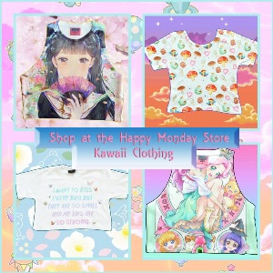
 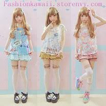
Use the code: "arlenafae" for 10% off purchases at:
http://fashionkawaii.storenvy.com/ |
 RSS Feed
